
By the Unkover editorial team—last updated: May 26, 2026

Competitor website analysis is the practice of reading a rival’s public website as an intelligence artifact—across positioning, product, conversion, marketing engine, and revenue signals—to infer strategy, sales motion, and likely next moves. It’s broader than competitor SEO analysis. This guide gives you a five-layer frame and a 60-minute workflow you can run in a browser.
If you’ve searched for this topic before, you’ve probably landed on a vendor tool page that reduces "competitor website analysis" to traffic estimates, backlinks, and keyword overlaps. Useful, but narrow. A competitor’s website tells you what category they claim, who they’re selling to, how they want you to buy, and where their revenue is leaning—long before any of it shows up in a Crunchbase entry or an earnings call.
This piece is tool-agnostic and timed. Every step works in a browser. Where a tool genuinely saves time, we name it.
TL;DR: Competitor website analysis reads a rival’s site across five layers—positioning, product, conversion, marketing engine, and revenue signals. This guide gives you a 60-minute runnable workflow, a 14-check browser audit, a 15-signal monitoring cadence table, and three worked examples. No paid tools required to start.
Why a competitor’s website is your highest-signal public source
A rival’s website is the single artifact they update most often, control most tightly, and expose most publicly. Press releases lag launches by weeks. LinkedIn shows what people post, not what the company ships. G2 reflects buyer mood from six months ago. The website reflects what marketing, product, and revenue leadership agreed to say this week.
It’s also the only public source where you can read change over time. Pricing-page edits, new comparison pages, retired feature pages, fresh case studies, shifting CTAs—each one is a decision someone signed off on. String enough decisions together and you’ve reconstructed a roadmap.
The catch: a website is curated marketing surface, not internal truth. Read it the wrong way and you’ll mistake a tagline for a strategy. The five-layer frame below is how you separate signal from theater.
The five layers of competitor website analysis
Most competitor website analysis stops at traffic and keywords. That’s one layer. There are five.
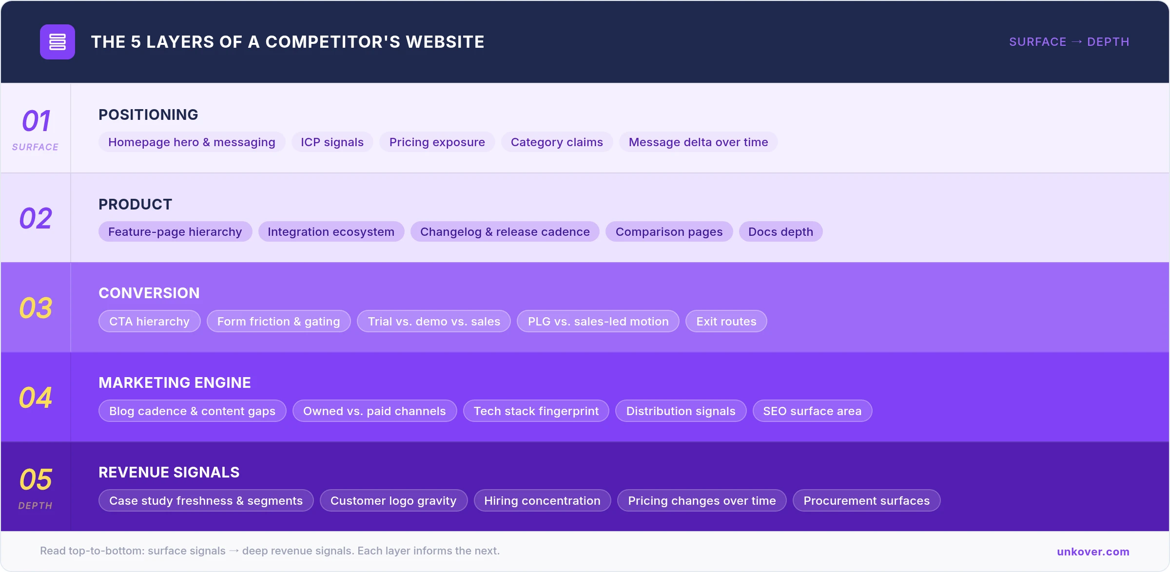
Each layer answers a different question. Positioning tells you what they claim. Product tells you what they ship. Conversion tells you how they sell. Marketing engine tells you how they grow. Revenue signals tell you where the money is leaning. Run all five and the website goes from billboard to dossier.
1. Positioning—what they claim to be
The homepage hero is the most-edited paragraph at any B2B company. Read it carefully.
Look at the category claim (what slot do they want in the buyer’s head—"AI sales agent," "customer data platform," "competitive intelligence software"), the lead problem (what pain they put above the fold), and the named audience (industry, role, company size cues in nav and footer). Pricing-page visibility matters as much as the hero copy: public pricing, partial pricing, or no pricing at all tells you whether they’re chasing self-serve volume, qualifying a sales motion, or doing custom enterprise deals.
Then add the time dimension. Pull the same homepage in the Wayback Machine at 6, 12, and 24 months ago. A category claim that’s tightened over four snapshots is a company finding focus. One that’s drifted across three categories in a year is a company still hunting for a story.
Signal: repeated ICP language, pricing exposure, comparison-page targets, category terms that show up in nav + hero + footer. Noise: one-off campaign slogans, hero animations, generic brand adjectives ("powerful," "intuitive," "modern").
2. Product—what they actually ship
A feature only gets a standalone page when somebody internal is willing to defend it. That’s a stronger signal than any keynote.
Audit the feature-page hierarchy: which capabilities have dedicated pages, which are buried as bullets on a catch-all, which used to have pages and quietly disappeared. Check the integrations page—the partner logos at the top are the ecosystems they bet on, and the absences tell you who they’ve decided not to chase. Look at the changelog or "What’s new" page for cadence and theme: monthly cosmetic updates read very differently from quarterly capability shipments.
Docs depth is an underrated tell. A help center with 200 articles and granular implementation detail is a product with real customers; a docs site with 12 marketing-heavy pages is a product still in early adopter mode.
Comparison pages name names. If a competitor has a "Us vs. [Vendor X]" page live, they’ve decided X is a deal they expect to fight—and which talking points they think they can win on.
Signal: repeated product themes across pages, dense integration logos, comparison targets, changelog rhythm. Noise: isolated launch banners, vague "AI-powered" labels without workflow detail, marketing-deck screenshots without product context.
3. Conversion—how they want you to buy
The CTA hierarchy is the cleanest read of any company’s go-to-market motion.
Map every primary CTA on the homepage, the pricing page, and the top three feature pages. The mix of Start free, Book a demo, Talk to sales, Contact us, and Get a quote—and which one sits in the top-right nav—tells you whether they’re product-led, sales-led, or hybrid. Then check form friction: count the fields, note the role and company-size gating, see whether they hand off to a calendar embed or a "we’ll be in touch" page.
The trial motion is often the most misread layer. Immediate product access points to PLG. A "request access" wall points to qualification before product. A pricing page that routes everything through "Contact sales" is a sales-led motion regardless of what the homepage claims.
Don’t ignore the exit routes: chat widgets, interactive product tours, ROI calculators, and live-demo embeds are all conversion bets a team chose to fund. Add the trust surfaces—SOC 2 badge, trust center, DPA links, procurement contact—and you can usually tell whether enterprise is their core motion or a stretch they’re aiming at.
Signal: CTA hierarchy, form friction, trial gating, trust-center presence and depth. Noise: isolated button color or copy tweaks; chat-widget defaults that ship with the website builder.
4. Marketing engine—how they grow
This is the layer where SEO tools genuinely add value, but they’re a piece of the picture, not the picture.
Map blog cadence and topic mix: how many posts per week, recency of the latest piece, whether they’re publishing operator how-tos or TOFU broad-net content. Look at the resource library—webinars, templates, reports, free tools, comparison pages, alternative pages. A resource shelf heavy on "[Competitor] alternatives" pages is a company running an active capture motion. A resource shelf heavy on "State of [Category]" reports is a company playing for category authority.
Run the site through Wappalyzer or BuiltWith for a technology fingerprint: analytics stack, CDP, A/B testing tool, personalization engine, consent platform, chat. Wappalyzer’s free account currently includes 50 technology lookups and five website alerts per month. BuiltWith is free for individual site lookups and covers 414 million domains across 113,886 technologies. The stack tells you what the marketing team is willing to maintain—and where they spend.
For traffic estimation, the Similarweb extension gives you directional channel mix and geography. Pair it with the Ahrefs Traffic Checker, which can batch up to 200 sites at once. Treat the numbers as deltas, not absolutes—Similarweb itself flags "not enough data" for low-volume sites, and small-site estimates from any tool are noisy.
Signal: repeated content formats, comparison and alternative pages, integration SEO, recurring tech stack categories. Noise: stand-alone category pages with no internal links, vanity tools nobody updates.
5. Revenue signals—where the money is leaning
The last layer is where most analysts stop too early. The website tells you a lot about whose money the company is taking.
Case-study freshness is the first read: how recent, which segments, named logos vs. anonymized, quantified outcomes vs. testimonial fluff. A case-study shelf that’s gone quiet for nine months usually maps to either a churn problem or a sales team that’s pulled stories internally. A sudden cluster of three enterprise case studies in one quarter is a clear upmarket bet.
Logo gravity matters more than logo count. Twenty SMB logos arranged democratically tells a different story than two Fortune 100 logos pinned above the fold. Check the careers page for hiring concentration—solutions architects and security engineers signal enterprise pull; growth marketers and customer support leads signal a self-serve scale-up. Geography of recent hires hints at regional bets months before a launch announcement.
Pricing language changes are the loudest revenue signal of all. Tier names that shift from "Starter / Pro / Business" to "Team / Business / Enterprise" is a company moving upmarket. Per-seat language becoming usage-based language is a packaging rethink. A pricing page that quietly removes the lowest tier is a deliberate filter on who they want as customers.
Signal: new pricing tiers, fresh enterprise proof, role-specific hiring, named procurement contact. Noise: decorative customer-logo walls with no case studies, "Trusted by" sections without context, awards badges from anonymous publishers.
The 60-minute audit workflow
Five layers is a frame, not a process. Here’s the runnable version. One hour, three blocks: a 15-minute scan, a 45-minute structured audit, and an ongoing monitoring routine.
First 15 min: the high-signal scan
This is the pass that tells you whether the deeper audit is worth your hour. Open the competitor’s site in a fresh browser tab and hit four pages, in this order.
- Homepage hero. Read the H1, the subhead, and the primary CTA. Write down one sentence: "This company sells [product] to [audience] for [outcome]."
- Pricing page (or the absence of one). Note whether pricing is public, partial, or hidden behind contact-sales. Capture the tier names and the headline price points.
- One feature page. Pick the one they link from the homepage hero. Note whether it’s specific to a workflow or a generic "platform" pitch.
- About / Team page. Skim the team-size cues, founder names, and any investor logos. Capture the headcount range if shown.
The output of this block is a one-paragraph "what does this company say it is." If that paragraph reads coherent and consistent, the company is on-message. If you can’t write it without contradictions, the company is mid-pivot—and the 45-minute audit becomes more valuable, not less.
Next 45 min: the structured audit
Run these 14 checks in order, in your browser. Capture answers in a spreadsheet—one row per check, one column per competitor.
- Category claim: record the exact category language used in the hero, nav, and meta title.
- ICP signals: list every audience cue (industry pages, role pages, company-size language) in the nav and footer.
- Pricing exposure: public, partial, or hidden. Capture all tier names, prices, and seat/usage language.
- Wayback delta: pull the homepage at 6, 12, and 24 months ago via the Wayback Machine. Note category, hero, and pricing changes.
- Feature-page inventory: list every standalone feature page from the top nav and any "Product" mega-menu.
- Integrations page: capture the top 10 partner logos by visual prominence; flag any ecosystem absences that surprise you.
- Changelog / What’s New: record the frequency and the last three release themes.
- Comparison pages: list every "[Competitor] vs. [Rival]" or "Alternative to [Rival]" page they publish.
- CTA map: for the homepage and three feature pages, record the primary CTA, secondary CTA, and any in-line CTAs. Note which sits in the top-right nav.
- Form friction: open the demo or signup form. Count fields, note role and company-size gating, capture the post-submit handoff (calendar, "we’ll be in touch," product access).
- Trust surfaces: SOC 2, ISO, GDPR, trust center, DPA, security page, procurement contact. Yes / no for each.
- Tech fingerprint: run Wappalyzer and BuiltWith on the homepage and the pricing page. Capture analytics, CDP, chat, A/B test tool, consent platform.
- Traffic shape: open the Similarweb extension and the Ahrefs Traffic Checker. Note total monthly visits, top channel, top geography.
- Case-study + careers read: count case studies published in the last 12 months and segment them by logo size. Open the careers page; capture the three most-hired roles and any new geography.
If you want to go deeper on a specific check, browser DevTools is the no-tool fallback that beats every paid alternative for DOM-level inspection. Chrome’s official docs cover both DOM inspection and network request inspection. You can read hidden form fields, structured data, request chains, and analytics calls without leaving the page.
Ongoing: what to monitor and how often
A one-time audit is a snapshot. The intelligence is in the delta over time. Set monitors on the signals that actually move, at the cadence that matches how fast they change.
| Signal to monitor | Cadence | Primary tool | Fallback |
|---|---|---|---|
| Homepage hero / subhead | Weekly | Visualping | Manual screenshot diff |
| Pricing page | Weekly | Visualping or Distill.io | Wayback Machine |
| Feature-page additions or removals | Biweekly | Visualping | Manual nav audit |
| Comparison pages against named rivals | Biweekly | Visualping | Site search |
| Changelog / release notes | Weekly | RSS or Distill.io | Manual check |
| Case studies / customer stories | Biweekly | Visualping | Manual browse |
| Customer-logo wall | Monthly | Manual screenshot diff | Wayback Machine |
| Careers page / open roles | Monthly | Distill.io | Manual count by function |
| Security / trust center updates | Monthly | Visualping | Manual review |
| Blog cadence and topic shifts | Monthly | Feed reader or spreadsheet | Site search |
| Integration-page additions | Monthly | Visualping | Manual audit |
| Footer / legal pages (DPA, terms, privacy) | Quarterly | Distill.io | Manual check |
| Tech stack changes | Monthly | Wappalyzer or BuiltWith | DevTools |
| Traffic / channel mix | Monthly | Similarweb extension | Ahrefs Traffic Checker |
| Paid-search posture / ad copy | Monthly | External SEO/PPC tool | SERP spot checks |
Visualping’s free tier covers five monitored pages, 150 checks a month, and a 60-minute minimum interval—enough for the four or five highest-priority pages on two or three rivals. Distill.io’s free plan covers 25 monitors (five in cloud, the rest in a browser extension), 1,000 cloud checks a month, and a 6-hour minimum cloud interval—better when you want quantity of low-priority watchers.
The discipline that separates a real monitoring routine from a folder of dead alerts: review the diffs weekly, summarize what changed in two sentences, and write one sentence on what each change might mean. A diff you don’t interpret is a diff you didn’t actually monitor.
Reading the signals—three worked examples
Frameworks read better when you see them applied. Three cases, three motions.
Notion—positioning and conversion
Notion’s homepage still leads with template-driven, self-serve language, but the nav surfaces enterprise security and AI capabilities prominently, and the pricing page now keeps free, plus, business, and enterprise tiers in one frame. Read across the five layers and the website signals a hybrid PLG-plus-enterprise motion, not the pure self-serve play it was three years ago. The conversion layer confirms it: Get Notion free sits next to Request a demo, and the trust surfaces (SOC 2, GDPR, HIPAA on the business tier) are designed for procurement reads, not weekend project starters. If you were watching Notion as a competitor, the enterprise nav surface and the security page depth would have told you the motion was shifting months before any earnings commentary.
Linear—pricing and sales motion
Linear keeps pricing public and simple, with a free tier and clearly listed paid tiers, but the enterprise page is where the website carries its real signal. Dedicated security documentation, SSO and SAML callouts, and a separate "Talk to sales" path for enterprise tell you Linear is product-led but disciplined and upmarket-ready—they want bottoms-up adoption to keep funneling teams, but they’re building the surfaces a procurement team needs once the team becomes a 500-seat deal. The case-study shelf reinforces it: named engineering leadership at recognizable companies, quantified ship-velocity outcomes, not testimonial fluff. The takeaway for a rival isn’t "Linear is going enterprise"—it’s "Linear is keeping the self-serve story intact while removing every reason an enterprise buyer would walk away."
Costco—non-SaaS revenue model
Costco demonstrates that the five-layer frame is not a SaaS framework. The membership offer is embedded in the nav, the homepage, and even the checkout—not buried in a fine-print footer. The site is structured so that the membership economics show up in the UX before they show up in any annual report: you can’t go deep into pricing or category browse without bumping into a membership prompt, gated savings, or a renewal nudge. Read across the layers and the conclusion is structural, not editorial—recurring membership revenue is the business model, and every page on the site is designed to defend or grow it. If you were analyzing Costco as a competitor in retail, this would tell you that price-on-shelf and SKU breadth are not the lever; the lever is membership renewal economics, and any move that risks renewal is the move they won’t make.
Common pitfalls in competitor website analysis
The five-layer frame and a runnable workflow won’t save you from these. Read for them on every audit.
- Confusing marketing claims for product reality. A homepage hero is a claim, not evidence. Triangulate every claim against docs depth, changelog cadence, and case-study substance before you treat it as fact.
- Ignoring the careers page. Hiring data leaks roadmap intent months earlier than any product launch. A surge in security or solutions-architect hires is an enterprise bet. A pause on engineering hiring while marketing keeps growing is a cost-discipline shift.
- Reading one snapshot instead of a delta. A single audit tells you what the company says today. The intelligence is in what they used to say and what they stopped saying. Build the time dimension in from day one.
- Over-indexing on traffic estimates. Similarweb and Ahrefs are directional, not gospel. Use them to find deltas—channel-mix shifts, sudden organic drops—not to argue absolute market share in a leadership review.
- Treating "no public pricing" as one thing. It can mean enterprise sales-led, channel partner-driven, regional complexity, custom services, or weak packaging discipline. Triangulate with the CTA hierarchy, the demo form, and the trust-center surfaces before drawing the conclusion.
- Stopping at SEO competitor analysis. Keywords, backlinks, and traffic are one layer of five. If your "competitor website analysis" output is only those three numbers, you’ve done a competitor SEO audit, not a competitor website analysis.
FAQ
How can you analyze a competitor’s website for free?
Open a browser. Run the 60-minute workflow above using only the free tiers of the Wayback Machine, Wappalyzer, BuiltWith, the Similarweb extension, the Ahrefs Traffic Checker, and browser DevTools. The five-layer audit doesn’t require a paid SaaS tool. Paid tools save time on ongoing monitoring, not on the first audit.
What tools do you actually need for competitor website analysis?
A browser with DevTools, a spreadsheet, and free accounts on Wayback Machine, Wappalyzer or BuiltWith, the Similarweb extension, and Ahrefs Traffic Checker. For monitoring over time, add Visualping (five monitored pages, 150 checks a month on the free tier) or Distill.io (25 monitors, 1,000 cloud checks per month on free). Everything else is optional.
What’s the difference between a competitor website analysis and an SEO competitor analysis?
An SEO competitor analysis reads a site through keywords, backlinks, and organic traffic—one layer of the picture. A competitor website analysis reads positioning, product, conversion, marketing engine, and revenue signals—the full five-layer frame. SEO competitor analysis tells you how they’re winning search. Competitor website analysis tells you what business they’re actually running.
How often should you audit a competitor’s website?
A full five-layer audit twice a year per priority competitor. Continuous monitoring on the high-velocity surfaces—homepage hero, pricing, changelog, comparison pages—at the cadences in the table above. After any visible strategic move (a re-brand, a pricing change, a new comparison page), run the high-signal 15-minute scan within 48 hours.
Is a competitor website checker enough on its own?
No. A "competitor website checker" usually means an automated traffic and keyword estimator—one layer of the analysis, plus a confidence interval that gets worse for smaller sites. Use it as a directional input, not a complete audit. The positioning, conversion, and revenue layers don’t show up in any checker; they only show up when a human reads the site.
Can AI replace manual competitor website analysis?
Not yet at the layers that matter most. AI is excellent at surfacing changes and summarizing diffs—pair it with Visualping’s AI summaries or your own LLM workflow for first-pass triage. The interpretive layer—what a pricing change means, what a careers-page shift implies—still benefits from an operator who knows the market. Use AI to scale monitoring; keep the analysis human.
What to do with what you find
A competitor website analysis is only useful if it changes a decision. After every audit, force the output into one of three buckets: a positioning move you should mirror or counter, a product or pricing bet to brief sales on, or a leading indicator to set up a monitor for. If a finding doesn’t fit any of the three, file it and move on.
For the next step in your competitive intelligence routine, go deeper on how rivals actually run their growth playbooks in our guide to identifying a competitor’s marketing strategy, pair the website audit with the broader competitive intelligence analysis workflow, browse the tools we recommend for ongoing CI work, and zoom out to the full competitive analysis framework.
Want practitioner-grade competitive intelligence guides in your inbox every week? Subscribe to the Unkover newsletter.