
Published July 27, 2026 by the Unkover editorial team. All pricing and positioning data was collected on July 27, 2026 from the vendors’ own public pages, each linked inline.
TL;DR
- A full competitor analysis example, run end to end on four real companies: Help Scout, Zendesk, Intercom, and Freshdesk.
- Three finished artifacts, filled in and sourced: a feature and pricing matrix, a positioning map, and a battle card.
- Every number links to the vendor page it came from, with the date we read it. Nothing here is estimated.
- The first finding arrived before any comparison did: the four vendors don’t publish prices on the same basis, so a naive side-by-side is wrong by construction.
- Two cells stay empty on purpose. What the analysis couldn’t answer matters as much as what it could.
Search for a competitor analysis example and you get a menu of frameworks. SWOT, VRIO, Porter’s Five Forces, the 3C model. Or you get a walkthrough that ends in a hypothetical: a made-up coffee subscription startup, a fictional dental SEO agency, a comparison table populated with companies that don’t exist.
We read the ten pages currently ranking for this query. Not one of them plots a positioning map with real points on it. Not one shows a battle card. The longest runs past 4,500 words and introduces its examples with “imagine this: you are a product manager.”
So we ran one instead. Four real companies in a market anyone can verify, analyzed from the seat of a product marketer who has to brief a sales team on Monday. What follows is the whole output: the grid, the map, the card, the decisions that came out of it, and the two questions the data refused to answer.
You can check every figure yourself. That’s the point of doing it this way.
What does a real competitor analysis example look like?
A finished competitor analysis is three connected artifacts rather than one document. A matrix holds the raw comparison, a positioning map turns that comparison into a picture of the market, and a battle card compresses both into something a rep can use in a live call. The analysis isn’t done when the grid is full. It’s done when a decision changes.
Most teams stop at the grid, which is the easy part—data entry with a deadline. The work that earns its keep happens in the two steps after it, when you decide what the data means and what you’re going to do differently on the back of it.
So the sequence below runs scope, matrix, map, card, decisions. Each one feeds the next, and skipping any of them leaves the last one unsupported.
If you want the blank version of the grid to work in, we publish the format this example fills in separately.
Which competitors made the shortlist, and which got cut?
We analyzed the customer support software market from Help Scout’s point of view, against Zendesk, Intercom, and Freshdesk. A company made the list if it sells into the same buying committee, shows up in the same evaluations, and publishes enough pricing to verify. Everything else got cut.
That last criterion is unusual and deliberate. This is a public teardown, so anything we couldn’t source from a primary page couldn’t go in.
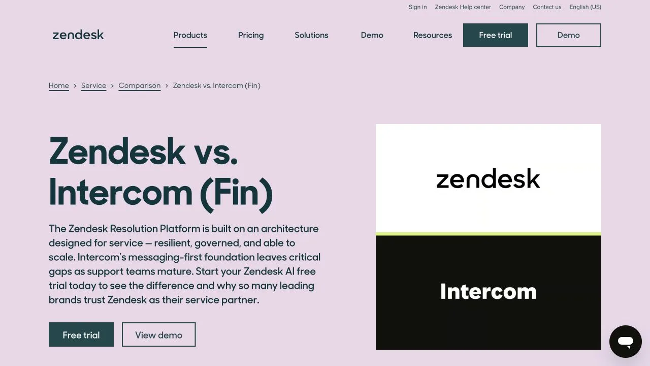
The first two did most of the filtering, and Zendesk did some of it for us. It publishes Zendesk vs. Intercom and Zendesk vs. Freshdesk comparison pages, naming two of our four as its primary rivals. When a competitor tells you who its competitors are, believe it.
What got cut, and why:
| Excluded | Why |
|---|---|
| Salesforce Service Cloud | Different buying committee. Lands through an existing CRM relationship rather than a support-tool evaluation. |
| Front, Gorgias, and other niche inboxes | Real overlap, but segment-specific. Would widen the grid without changing a decision. |
| Generic AI chat startups | Solve one channel rather than the help desk. Worth monitoring as replacement threats, not comparing feature by feature. |
Those exclusions aren’t throwaway. The reason a four-column grid stays useful while a twelve-column grid rots is that somebody wrote down why the other eight are missing. A narrow list is also the norm among teams doing this for a living: in Crayon’s 2025 State of Competitive Intelligence survey of 400+ B2B SaaS practitioners, half of respondents track 10 competitors or fewer. If you’re unsure where to draw the line, the distinction between direct, indirect, and replacement rivals decides which competitors belong on the shortlist in the first place.
What does a filled-in feature and pricing matrix look like?
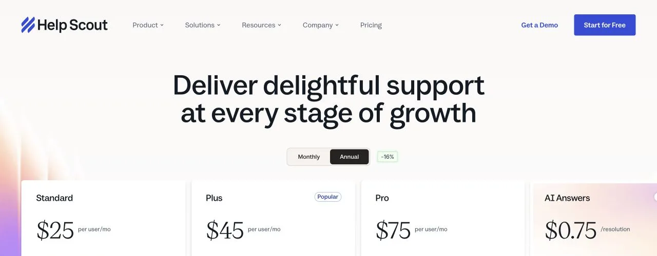
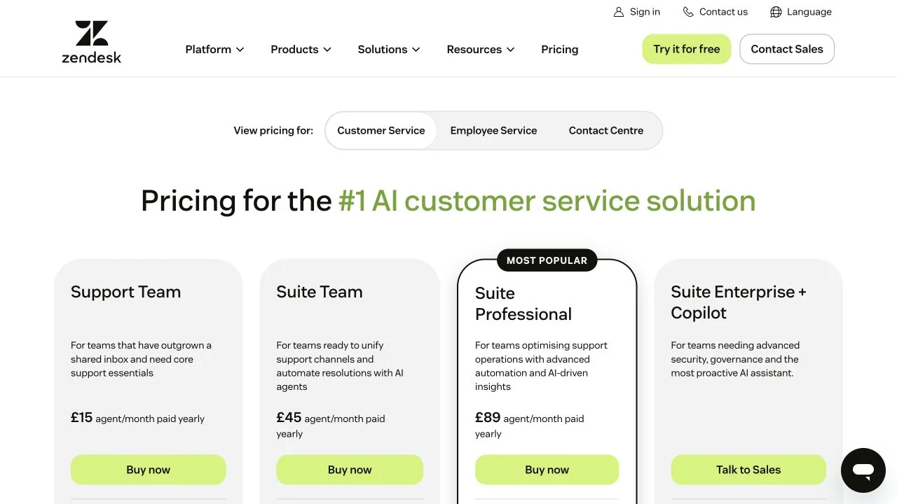
This one. Every figure below was read on July 27, 2026 from the vendor’s own pricing page, linked in the header row. Where a vendor doesn’t publish a number, the cell says so rather than guessing.
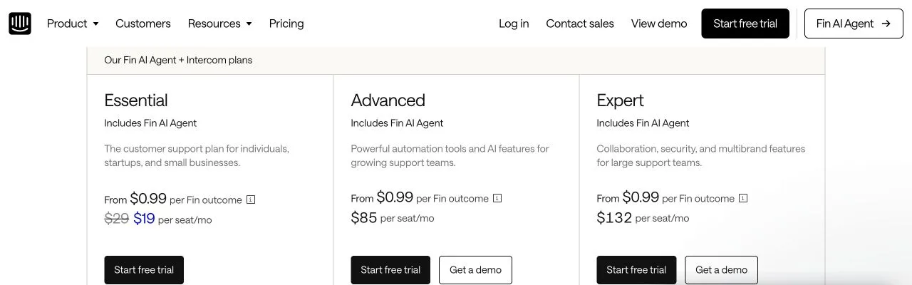
One finding outranks everything in the grid, and it showed up before we could compare anything: the four don’t publish on the same basis. Zendesk and Freshdesk show per-agent prices already discounted for annual billing and never show the monthly rate. Help Scout shows monthly list and states a 16% annual discount without showing the discounted figure. Intercom doesn’t render seat prices on its pricing page at all; those numbers live in a help center article, while the pricing page leads with the price of an AI outcome.
Line those four up without normalizing them and you’ve compared four different things. In every fictional example we read, this problem doesn’t exist, because invented data is always internally consistent.
The grid
| Help Scout | Zendesk | Intercom | Freshdesk | |
|---|---|---|---|---|
| Billing basis published | Monthly list, 16% off annual | Annual only | Both (in help center) | Annual only |
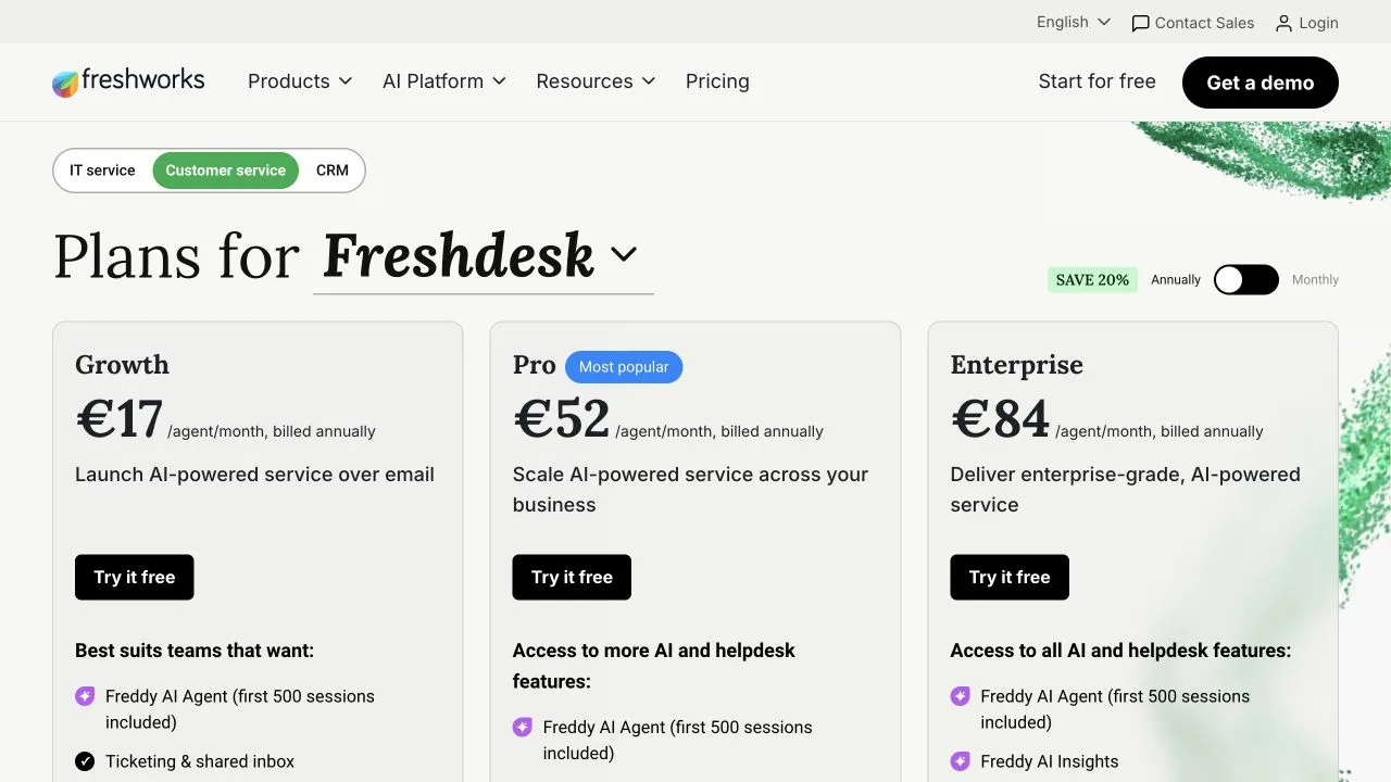
| Entry paid seat | $25 (Standard) | $19 (Support Team, email and ticketing only) | $29 annual / $39 monthly (Essential) | $19 (Growth) |
| Mid tier seat | $45 (Plus) | $55 (Suite Team) | $85 annual / $99 monthly (Advanced) | $55 (Pro) |
| Top self-serve seat | $75 (Pro) | $115 (Suite Professional) | $132 annual / $139 monthly (Expert) | $89 (Enterprise) |
| Tier with no public price | None | Suite Enterprise + Copilot | Fin standalone | None |
| Free plan | Yes, 5 users, 1 inbox, 1 docs site | No | No | Not confirmed on the page we read |
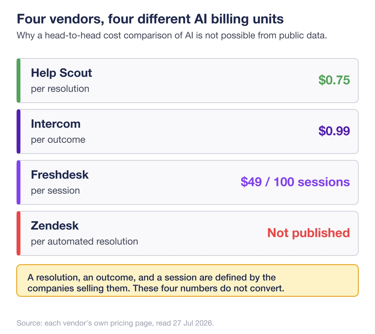
| AI billing unit | Per resolution | Per automated resolution | Per outcome | Per session, in packs |
| Published AI unit price | $0.75 | Not published | $0.99 | $49 per 100 sessions |
| AI assistant add-on | Included (AI Drafts on Plus and up) | Copilot, $50/agent/mo | Copilot, $29/agent/mo annual | Freddy Copilot, $29/agent/mo |
Three things fall out of this grid that no amount of prose would have surfaced.
Zendesk and Freshdesk match at the dollar: entry at $19, mid tier at $55, on both. Two independent companies don’t arrive at identical price points twice by accident. That’s mirrored pricing against a named rival, and it says those two are fighting each other much harder than either is fighting Help Scout.
Help Scout’s top self-serve tier undercuts Intercom’s middle one, $75 against $85. A buyer comparing “the good plan” at each vendor faces a gap running the opposite direction from the brand perception.
And the AI pricing units don’t reconcile. An outcome, a resolution, and a session are three different things, and Zendesk doesn’t publish a unit rate for the fourth. We’ll come back to that cell, because it’s the most consequential one in the grid and it’s the one we had to leave empty.
If you want to build this grid from scratch for your own market, we cover how to structure the comparison itself in a separate piece.
How do you turn a matrix into a positioning map?
Pick the two axes the matrix argues for, not the two you already believe in. Plot each competitor using only values from the grid. If every player lands in the same corner, the axes are wrong: swap one and redraw. A useful map produces separation and at least one surprise.
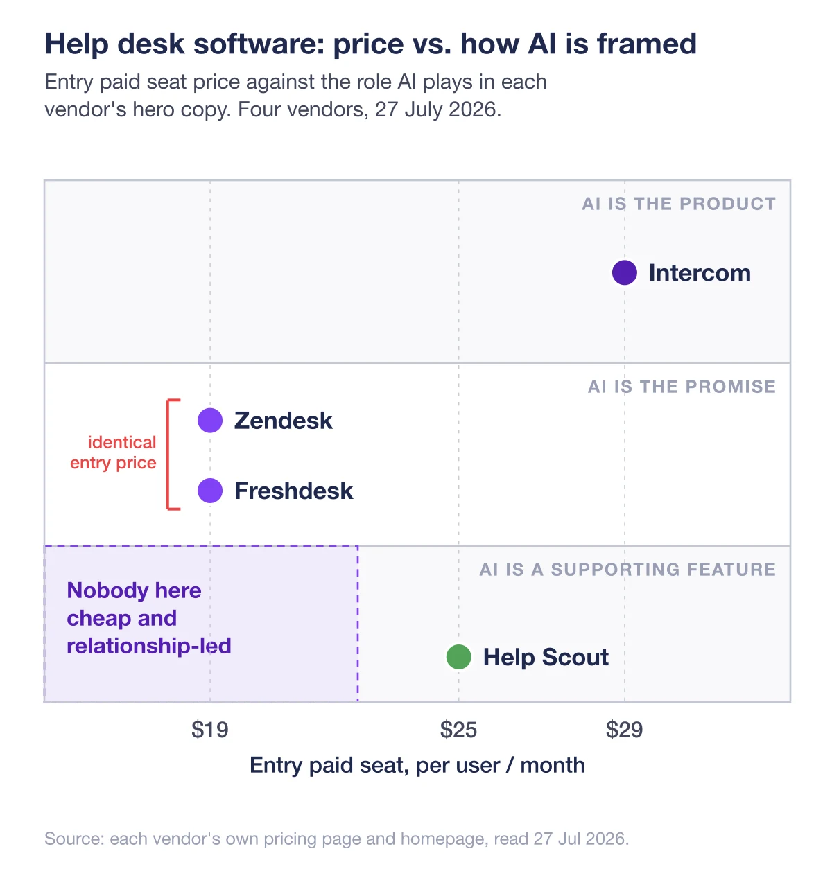
The matrix argued for entry price and AI centrality.
Entry price rather than average price, because entry price decides which deals a vendor shows up in at all. The grid gives a clean spread from $19 to $29.
AI centrality comes from the homepages rather than the pricing pages, and it separates the field harder than any feature does. Three of the four lead their hero copy with AI. Zendesk positions itself as an AI-first service platform, Intercom as the help desk built for the AI agent era, Freshdesk as a guided path from a first AI agent to AI everywhere. Help Scout’s hero leads with customer relationships and mentions AI only in the supporting line.
One vendor out of four is making a different argument about what the category is for. That’s a positioning fact, and it appears nowhere in a feature comparison.
Reading the map:
- Zendesk and Freshdesk sit on top of each other. Same entry price, same AI-forward pitch. From a buyer’s seat they’re near-substitutes, which explains the mirrored pricing.
- Intercom sits alone in the expensive, AI-native corner. It charges the most per seat on every tier, and it’s the only one whose pricing page leads with the price of an outcome rather than the price of a person. The pricing structure and the positioning are the same argument.
- Help Scout is alone for the opposite reason: mid-priced entry, human-centered pitch. That’s a position, not a gap to close.
The surprise is the empty quadrant. Nobody here is cheap and relationship-led. Whether that’s an opening or a graveyard is a strategy question rather than an analysis question, and the analysis should hand it over instead of pretending to answer it.
What goes on the battle card, and what gets left off?
A battle card is not a shorter version of the analysis. It holds the three or four facts a rep can use inside 30 seconds of a live objection, plus the traps. Anything a rep can’t say out loud without checking a source first gets left off. If it can’t be read during a call, it isn’t a card.
The analysis produced one card: Intercom, the hardest of the three to answer on price.
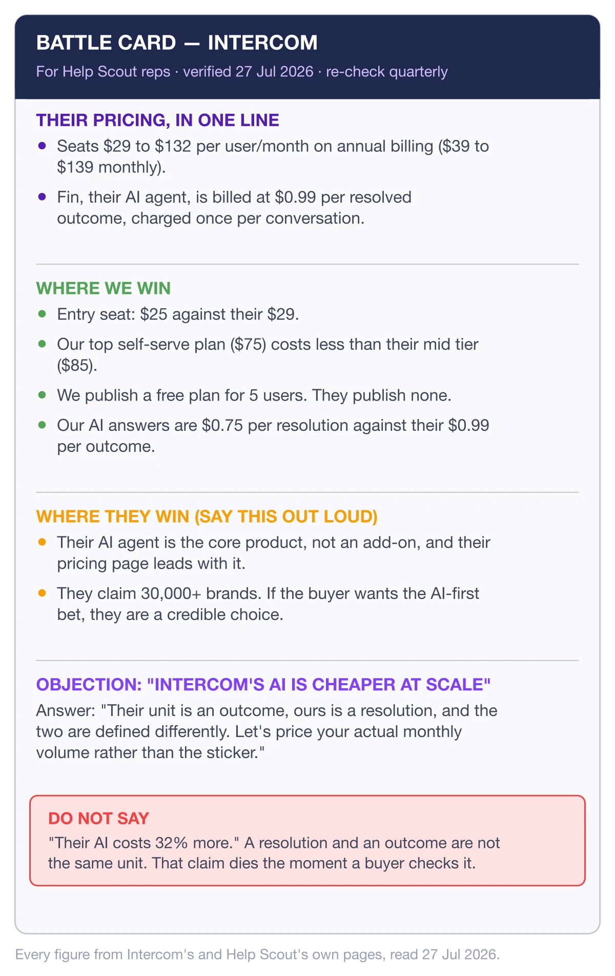
Note what’s missing. No feature matrix, no market share, no funding history, no adjectives. Reps don’t lose deals because they didn’t know a competitor’s Series D. They lose because somebody asked “why are you cheaper?” and they improvised.
Note the honesty line too. A card claiming the competitor is bad at everything gets discarded by the first rep who meets a happy Intercom customer, and the concession is what makes the rest credible. We go deeper on what makes a battle card survive contact with a real deal elsewhere.
Battle cards are also getting rarer. Crayon’s 2025 survey found 58% of CI programs still produce them, down from 76% in 2023, and the likeliest reason is maintenance cost. A card built from four public pages can be re-verified in an hour, which is the only kind that survives a second quarter.
Where did every number in this analysis come from?
Four vendor pricing pages, four homepages, and one help center article. All public, all read on the same day, all linked inline above. No analyst reports, no third-party aggregators, no review-site ratings. Single-day collection matters more than it sounds: SaaS pricing changes without notice, so a comparison assembled over three weeks is comparing three different markets.
Two collection details are worth stealing, because both are silent error sources.
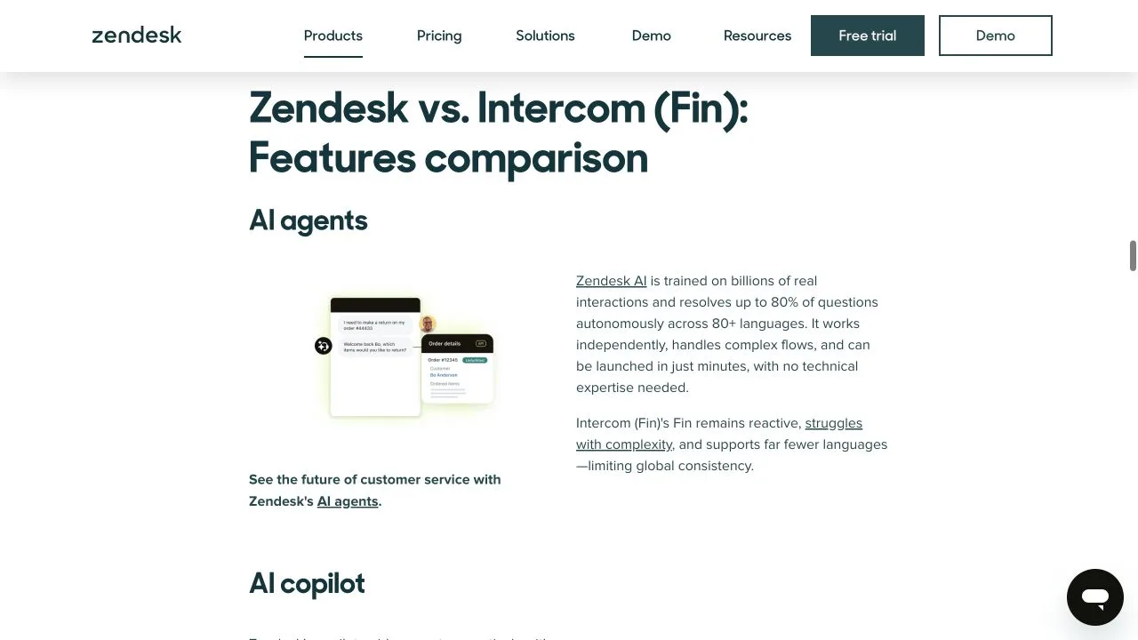
Geography changes the answer. Our first read of Zendesk’s pricing page came back in euros (€19, €55, €115) because the page geolocates, and the dollar figures only appear on the US version. Anyone collecting competitor pricing from a European connection and comparing it against US list prices is introducing an error they will never see.
Rendered pages hide numbers. Intercom’s seat prices aren’t in the markup its pricing page serves; JavaScript draws them in afterward. Read that page the way most scrapers do and you’d conclude Intercom doesn’t publish seat pricing. It does, in a help center article one click away. The lesson isn’t about Intercom. It’s that “not published” and “not where I looked” are different findings, and confusing them is how an analysis ends up wrong with confidence.
Pricing pages are one layer of a competitor’s site among several. The layer-by-layer audit of a competitor’s web presence covers the rest, since changelogs, careers pages, and status pages all leak strategy on a schedule.
What did this analysis change, and what can’t it tell you?
Three decisions came out of it and one question stayed open, which is a normal ratio. An analysis that resolves everything it touches was either trivial or dishonest.
The first decision was to stop benchmarking against Zendesk on price. The grid shows Zendesk and Freshdesk mirroring each other rather than chasing Help Scout, so price moves aimed at Zendesk would be aimed at a fight that isn’t happening.
The second was to lead with the total bill rather than the seat price. Seat-for-seat at entry is unflattering, $25 against $19. The comparison that includes AI metering may run the other way, which shifts the conversation from list price to what a support team pays in a month.
The third is a question the analysis handed upward: the empty quadrant needs a strategy answer before the next planning cycle. No competitor occupies cheap and relationship-led. That’s either an opening or a warning, and this work can’t tell which.
The two things this analysis cannot tell you
What AI costs across four vendors. Zendesk doesn’t publish a unit rate for automated resolutions, and the other three publish in units that don’t convert into each other—an outcome, a resolution, and a session are defined by the companies selling them. We could have modeled it. Modeling it would have produced a table of numbers that looked authoritative and meant nothing, so the cell stays empty.
Why deals are won and lost. Public data tells you what vendors claim. It doesn’t tell you what buyers do. That gap only closes with structured win/loss interviews, and no amount of pricing-page reading substitutes for it.
Being able to write “we don’t know” in a specific, bounded way is the difference between an analysis and a deck.
How long does an analysis like this take?
About four hours of collection and roughly two more for the artifacts, across four competitors with public pricing. The matrix is the slow part. The positioning map takes 20 minutes once the matrix is honest, and the battle card takes 30. Refreshing it later is much cheaper, about an hour a quarter, because you’re diffing rather than building.
The costs that surprise people are the two we hit above: normalizing prices published on different bases, and re-collecting a page that rendered differently than expected. Budget for both.
Refresh triggers matter more than the calendar. Redo the pricing row when a competitor changes a plan, redo the map when a competitor changes its hero copy, and redo the card when reps start losing an objection they used to win.
FAQ
How do you write a competitor analysis? Scope it first: name the competitors and write down why the others are excluded. Collect from primary sources on a single day, recording where each figure came from. Build the matrix, derive a positioning map from it, then compress both into a battle card. Finish by naming the decisions it changed.
What are the 5 steps of a competitive analysis? Scope the competitive set, collect data from primary sources, build the comparison matrix, map positioning, and convert the findings into a decision or an asset like a battle card. That fifth step is the one most teams skip, and it’s the only one that produces value.
What should a competitor analysis include? Pricing on a normalized basis, feature coverage relevant to your deals, positioning and messaging claims, and an explicit list of what you couldn’t verify. That last item is what makes the rest trustworthy.
How often should you update a competitor analysis? Quarterly as a floor, plus event-driven updates when a competitor changes pricing, hero messaging, or packaging. Diffing an existing analysis takes about an hour. Rebuilding an abandoned one costs a full day.
The part everyone skips
The artifacts above took about six hours. The decisions took another meeting. Most competitor analyses die in the gap between those two, which is why so many companies own a competitor spreadsheet and no competitive strategy.
If you take one habit from this competitor analysis example, take the empty cell. Leaving Zendesk’s AI unit price blank, rather than modeling a plausible number, is what makes the rest of the grid worth trusting. Every fictional example we read on the way to writing this had complete data, because invented markets always do. Real ones don’t, and saying so out loud is most of the job.
Want more teardowns like this one? Subscribe to the Unkover newsletter for a new competitive intelligence breakdown every week.